Today I'm sharing some of the color combos I've experimented with recently. All of these blends were created on sheets of 6 x 9 inch watercolor paper, created by cutting the Canson sheets in half. I blend on any number of paper, but when I know I'm going to use heavy water I opt for a watercolor paper or mixed media paper that can take the wet medium.
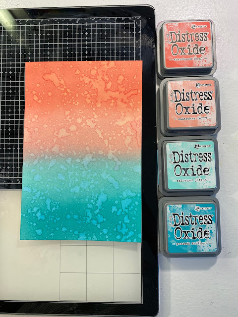
Color Combo #2:
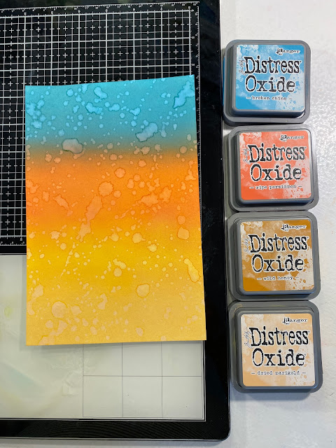
Color Combo #3:
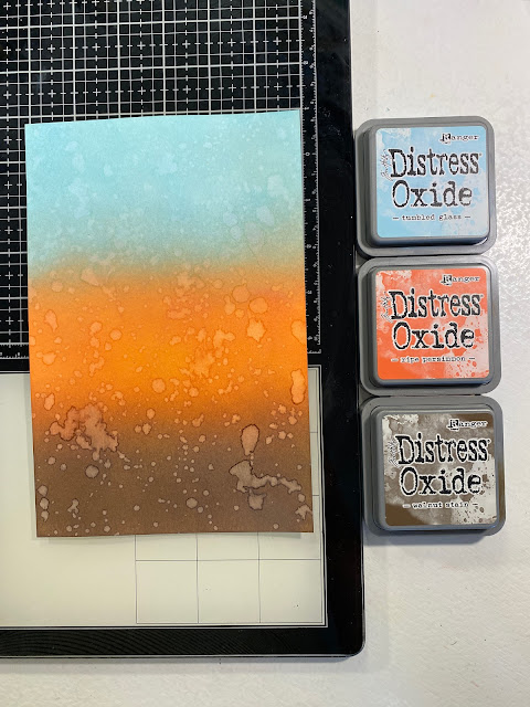
Color Combo #4:
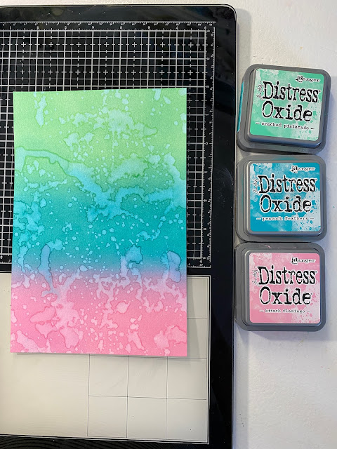
Color Combo #5:
- Chipped Saphire
- Pine Needles
- Cracked Pistachio
I ink-blended this trio and then splattered clean water over top. I like the dark rings around the water spots so I will splatter my water and let sit for a few seconds. After it sits, I hit it with the heat tool. After a minute or two with the heat tool, I will take a clean paper towel and lay it over top to absorb the excess and then lift it back up. After I've soaked up the extra water I finish drying it with my heat tool.
- Abandoned Coral
- Saltwater Taffy
- Salvage Patina
- Peacock Feathers
Again I came one with my clean water and worked my magic. For this combo, I was inspired by a few southwest colors I saw on Pinterest.
- Broken China
- Ripe Persimmon
- Wild Honey
- Dried Marigold
Rinse and repeat, same as the last two. I very often try combos to see what will happen. This would be one of those trials. I don't hate it, I'm not mad about it and it's better than horrible. I'll be honest it won't become a go-to combo, or even be revisited.
- Tumbled Glass
- Ripe Persimmon
- Walnut Stain
More of the same technique. For this combo, I was trying for something fall-inspired. I love the Walnut Stain and Ripe Persimmon, but Tumble Glass wasn't quite what I was going for. This one will most likely end up in the die-cut pile. No color experiment is wasted in my studio.
- Cracked Pistachio
- Peacock Feathers
- Kitsch Flamingo
I got a little heavier-handed with my water on this one, which is why watercolor or mixed media paper is a better option when building this kind of background. If I'd used cardstock this would have been a warped mess when it dried.
Color Combo #6:
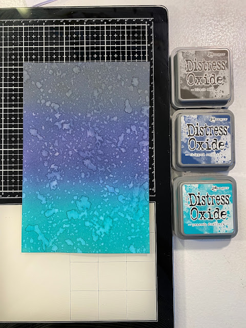
- Black Soot
- Chipped Saphire
- Peacock Feathers
This combo would be perfect for a moody dark winter sky. I can see this with a beautiful snowflake over top for a holiday card.
Why did I use a 6 x 9 inch sheet to try these color blends on? My intention for these was for future pen and ink trees. I don't always build background on this size sheet. If I choose not to draw a tree I can easily cut them into card backgrounds or use them for die cutting. I've shared Masculine Color Blends on A2 and if you want to go back in the time machine I shared Color combos using watercolor and mixed media scraps.
Don't let the size of the paper hang you up and keep you from trying color blends. I love using my Distress Inks and Oxides to build backgrounds for cards.


No comments:
Post a Comment