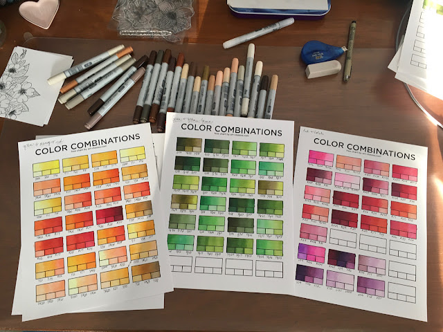
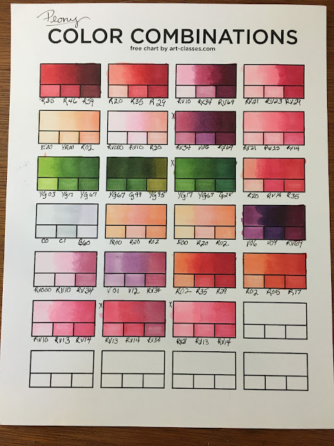
Copic markers are alcohol markers, the medium I turn to most often when creating my hand-colored cards. These markers are designed to blend and create depth when coloring. They're transparent and layering the colors creates a lot of definition. About a year ago I actually started keeping track of color combinations for blending.
Color swatching is about more than just a patch of color on a substrate. While trying colors on the substrate you'll be using is very helpful, I find more value in swatching when it comes to mixing or blending colors. This gives me a chance to try the combination to see if I get magic or mud out of it. This is especially helpful when creating a custom project.
I have a fairly large Windsor & Newton watercolor pallet, and a few months ago I took a few hours to create a mixing chart of colors. Watercolor is a fairly new medium for me, and I'm still learning all the possibilities. Watercolor is a very forgiving medium so that works in my favor for sure. I very often use tutorials from Let's Make Art, but I don't care for the liquid watercolors they sell. Having a swatch chart like the one above helps me find the right color mix to replicate their colors if I want a similar look.
The next color swatch/mixing guide on my list to create is one for colored pencils. I have a very basic swatch chart showing me what each color looks like, but nothing for mixing to build color layers with. Colored pencils are something I'm still learning as well.
When I'm working on a project, color swatching can be invaluable, especially when I'm working on a custom project. Very often I need to create samples for the customer and having a color chart to show them options is very handy. It's also extremely useful when a customer asks me to create additional cards at a later date. The swatches above were for a custom order for Good Pasture Farms, created in October of 2019. In March, she contacted me for additional cards of the same design and colors. Because I had a swatch chart, it was incredibly easy to go back and recreate the design she needed.
There is definitely value in color swatching, and I've become a convert. Color swatching has also allowed me to find colors in my collection that match up to a curated color pallet from other sources.


No comments:
Post a Comment